Ever wondered why some colors just seem to pop out at you, while others kind of fade into the background? Picture this: your kid’s toy blends into a mountain of blocks, except for that neon yellow fire truck that shouts for attention the second you walk into the room. There’s a steep, geeky science to all that. But more important for you and me is what this means for our closets, our shopping, even the way we see the world. Colors don’t just fill space; they grab, yank, and sometimes gently tug our attention when we least expect it.
The Science Behind What Grabs Our Gaze
#color psychology—it’s not just a clever trick by brands or fashionistas. There’s real science behind why certain hues jump out at us. At the core, it’s all about the human eye and the way our brains process signals.
Your eyes have two main types of photoreceptors: rods and cones. Rods see shades of gray and help out in the dark, but cones are the color kings. Humans have three types of cones, each tuned to a different part of the visible spectrum (think red, green, and blue). The highest number? The cones that pick up green light. But don’t jump to conclusions just yet.
On paper, the average person can see more shades of green than any other color. But if you want to get noticed, red and yellow crush the competition. Why? Because they occupy the sweet spot in the light spectrum that our brains treat with urgency. Studies—including ones done by the Pantone Color Institute and various psychology labs—show that attention spikes with reds, oranges, and yellows. Think about stop signs, sale tags, hazard lights, fire engines, and school buses. There’s a reason they’re never icy teal or forest green.
Then there’s the contrast effect. A blast of yellow in a sea of blue? Impossible to ignore. Your brain’s wired to notice sudden color shifts, especially if you grew up in the wild, where spotting a ripe berry or dangerous animal could mean life or death.
Let’s talk hard numbers. A 2022 survey by the Journal of Optometry polled more than 200 people and found that 62% picked yellow as the most attention-grabbing, while 30% picked red. Only a handful chose blue, green, or purple.
| Color | Perceived Visibility | Common Uses |
|---|---|---|
| Yellow | 62% | Warning signs, school buses |
| Red | 30% | Stop signs, sales tags |
| Blue | 5% | Corporate branding, electronics |
| Green | 2% | Road signs (directional), eco products |
| Purple | 1% | Luxury branding, rare flowers |
The takeaway? Brighter, warmer colors play louder. Red literally makes your heart race, raising blood pressure, and yellow can make you feel energized. This isn’t just old wives’ tales—it’s measured stuff. According to the National Institute of Health, the wavelength for yellow sits around 570 nanometers, precisely where the human eye’s sensitivity peaks. Red, at about 680 nanometers, still commands attention, but not quite as efficiently as yellow, at least under natural daylight.
Eye-Catching Colors in Fashion and Daily Life
If you ever lost your kid in a crowd, you know how crucial color can be. Try putting a child in a dull gray hoodie and watch how quickly they vanish on a city sidewalk. Bright yellow? Impossible to miss, even at a distance.
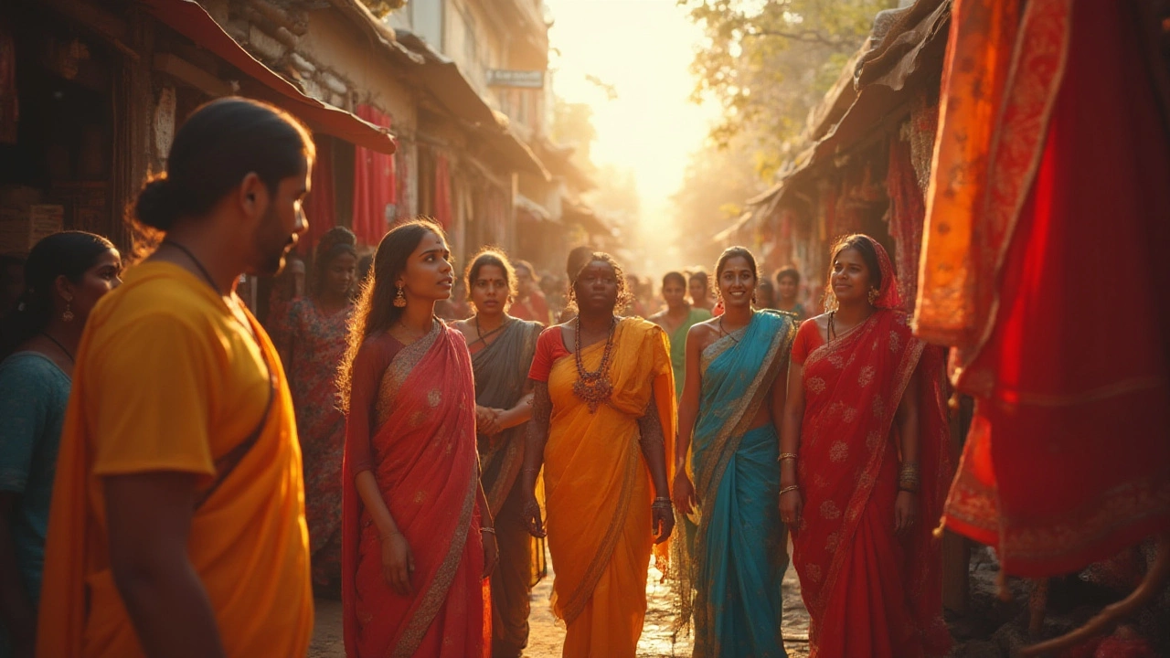
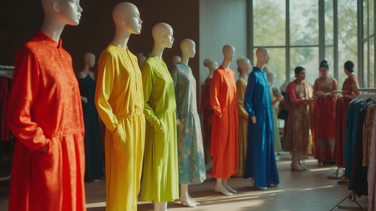
The fashion world and big brands milk this knowledge. Ever seen a runway show where everyone’s glued to a head-turning neon jacket or a poppy-red dress? Color is a secret weapon. Designers like Versace, Moschino, and even budget labels launch lines in bold yellow, cherry red, or highlighter orange every season, betting big that people want to be seen.
Retail experts know this too. If you look at clearance sales or “new arrivals” racks, you’ll often find a splash of red—psychologically linked with urgency and excitement. Sports teams? Home kits and away uniforms use bright colors so fans and TV viewers never lose track of the action.
This goes beyond clothes. Take your phone or laptop. Ever noticed how most “power” buttons are bright red? Even something as mundane as a recycling bin changes character with a green or yellow lid.
Parents get this instinctively. I used to buy my son Gideon shoes in “safe” navy and gray. After losing a pair at a family picnic, I switched to sneakers in blazing yellow and fire-truck red. Not only did he love them, but I never had to search for more than a minute.
Ever decorated a party? Throw in balloons in shades of yellow, orange, or hot pink and watch how they liven up even the dullest corner. In marketing, billboards splash yellow across promotions because your subconscious can process it faster in the blur of a passing car.
- If you want to stand out in photos, wear yellow, red, or vibrant blue. Avoid muddy greens or browns, unless you’re aiming for stealth.
- Picking a logo for your business? Try yellow for freshness, red for energy, or orange for creativity. Tech brands love blue, but it won’t turn heads quite as fast.
- Updating your wardrobe? One bold accessory—think scarf, sneakers, or a hat—in a high-visibility color can lift your look for cheap.
- When jogging or cycling at night, pick reflective or fluorescent yellow. Multiple safety groups, from the CDC to cycling organizations, all rank yellow as the most visible color in dim light.
- Shopping for your home? Use splashes of color to guide eyes. A yellow welcome mat, a red kettle on the stove, or bold kitchen towels can change the feel of a space in seconds.
Even pets wear color. Bright orange or yellow collars are easier to spot in a dog park—or if your furry escape artist breaks free.
Still, too much intense color can overwhelm. Interior designers usually suggest reserving neon highlights for small accents instead of entire walls, to keep spaces feeling balanced and not manic.
How Culture and Context Shape Eye-Catching Colors
Yellow and red win the science game, but context shifts everything. If you wear bright yellow to a funeral or a formal dinner, you’ll definitely catch eyes, but maybe not the way you want.
Cultural cues shape color meaning and impact. In China, red grabs attention but is also a lucky wedding color. In Western cultures, it’s passion or warning—think Valentine’s Day or stop signs. In India, yellow is linked with spring and joy. Meanwhile, ancient Egyptian priests wore yellow to show rank and divinity.
Even the time of day matters. Under daylight, yellow pops most. But at dusk or under sodium streetlights, white and neon green take the lead. Road construction crews in many cities now sport high-visibility lime jackets because studies from the Federal Highway Administration show they reduce accidents more than orange ones, especially in low-light conditions.
Fashion trends also nudge perceptions. Remember millennial pink? Five years ago, you’d hardly see it outside a little girl’s closet. Now, men’s shirts, sneakers, and gadgets rock soft pink shades. Sometimes the attention-grabbing element isn’t brightness but surprise—a color where you least expect it.
If you’re a designer or want your shop to stand out, scan what colors are already everywhere. Pick a contrasting pop for your shopfront or business cards. In busy shopping districts, yellow may blend in because everyone’s using it, so hot purple or turquoise might turn more heads.
Brands spend fortunes on color testing. Pepsi famously spent millions tweaking the blue shade on its cans to stand out from Coca-Cola’s red. “Unique color equity” is what they call it—owning a color in your customer’s brain.
Kids’ brands go wild, blending colors so stuff is never dull (there’s a reason kids’ cereal boxes look like a paint store exploded). In sports, teams sometimes change uniform colors for big games to mess with their opponents’ focus, playing with those primal color responses.
- If you want to get noticed in a crowd photo or at a festival, look for what’s missing in the sea of usuals—sometimes icy mint or ultraviolet stands out, even if it’s not scientifically the most “visible.”
- Returning lost items is easier if they have a unique color—think about labeling your water bottle or backpack in an offbeat shade, not just fluorescent yellow.
- Context flips everything. A white shirt at a color-splashed rave gets more attention than a red hoodie, just because it’s the wildcard.
Even personal mood and age play a role. Seniors tend to lose some sensitivity to blue and green, so red and yellow stay sharp, while teens and kids catch all the colors intensely. That’s why playgrounds and fast food places lean toward warmer hues—they just work for the most people.
Smart Tips for Using Eye-Catching Colors in Your Life
All that science and culture is cool, but how do you use it day to day? Here’s a grab bag of tricks to make color work for you without going overboard.
- Dress for impact. Got a big meeting, first date, or event? A single yellow, red, or orange accessory draws eyes without blinding folks. Start with a belt, tie, bag, or sneakers, and go from there.
- Get noticed when it counts. Athletes and outdoor enthusiasts know yellow is king for visibility. Your morning run on busy streets? Go yellow or chartreuse so drivers can’t miss you. For hiking, a bright backpack is easier to spot from far away, boosts safety, and makes for lively photos.
- Sport and activity gear: Study after study shows yellow and orange rank top for avoiding accidents, especially in low light or on water. Swimmers, cyclists, roadside workers all use this trick. Construction uniforms aren’t day-glow orange just for laughs.
- Branding and business: If you sell products, designs, or even run a food truck, experiment with accents in yellow, red, or orange to draw newcomers. Test with friends or family—see what colors make them pause or glance again.
- Home style picks: Tired of missing the kitchen scissors? Get a pair in canary yellow. Hate hunting for keys? Snap on a flame-red keyring. It sounds simple, but these small tweaks save time and frustration daily.
- Parent hacks: Marking school stuff? A yellow lunchbox or water bottle stands out in a pile; no more “Dad! Where’s my stuff?” meltdowns.
- Packing bags for travel? A sunny yellow suitcase is easier to spot on luggage carousels—and harder for someone else to walk off with.
- Don’t ignore contrast. A splash of yellow pops best against dark colors (blacks, navy, even deep green). Red zings against white or pale backdrops. It’s not always the color alone, but how it plays with its neighbors.
- Wired for habits. Start by changing small objects—phone charger, toothbrush, wallet—to bolder colors. You’ll notice how much easier things are to find in the rush of daily life.
Remember: in fashion and design, using eye-catching color is about balance. Even the most vivid item loses its magic if it’s fighting a rainbow. Use bright shades for single standout pieces or accents, with calmer tones to give your look or your home some breathing room.
Color is more than eye candy—it's a tool you can use. The science proves we’re wired to respond to certain hues. When you understand how your eye works, from cones to colors to contrasts, it’s way easier to win at first impressions, find lost socks, or just brighten up your feed. Yellow usually wins the “notice-me” contest, with red close behind, but context, contrast, and a little personal style can change that game for anyone, anytime.